San Francisco Flower Market
Revitalizing the website
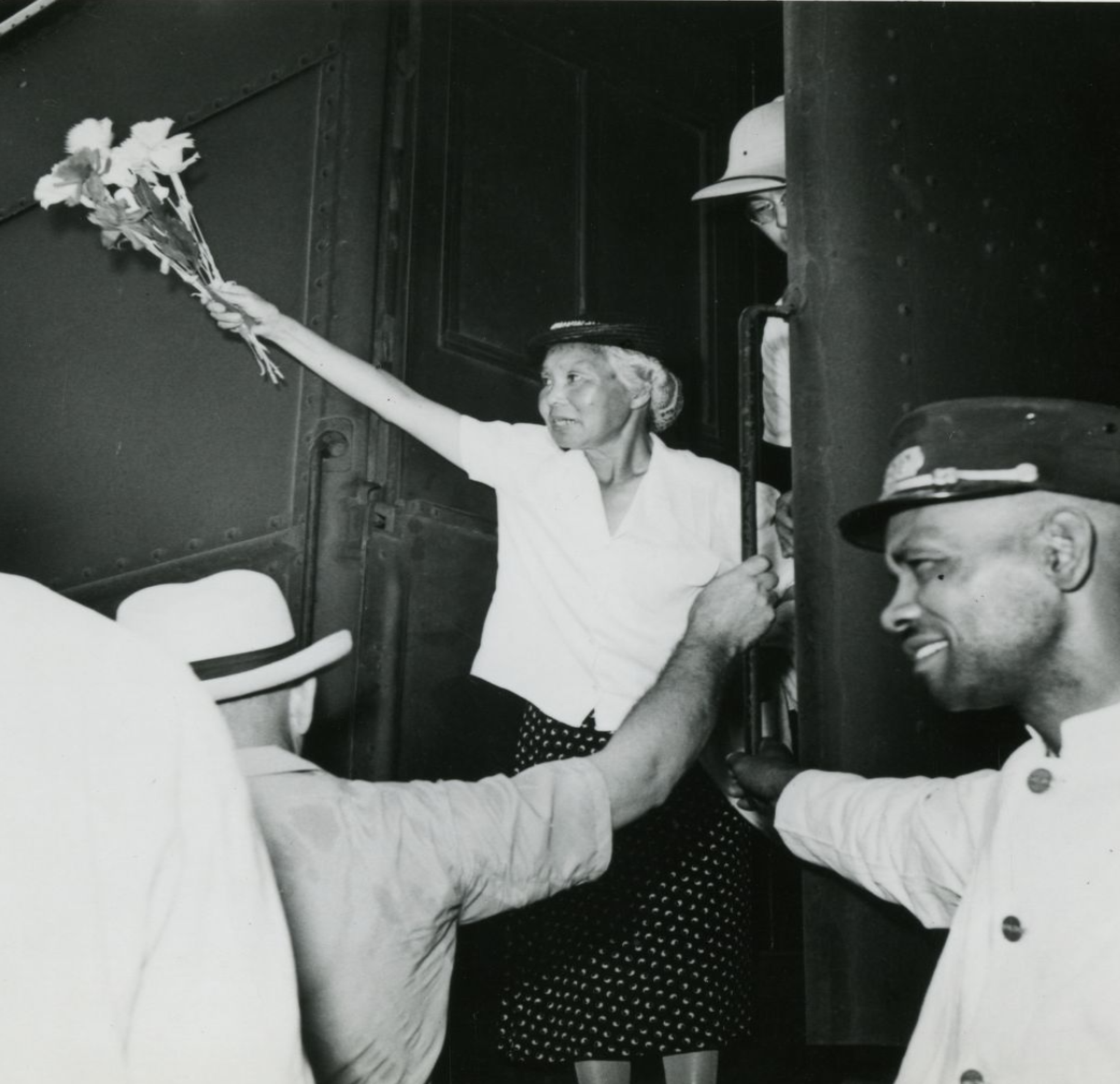
Established in 1956, the San Francisco Flower Market is a beloved historic landmark. However, its website was anything but timeless. It struggled to meet modern usability standards and failed to foster the vibrant online community the market deserves.
Our mission was clear, redesign the website to improve user experience and create a hub for floral enthusiasts, strengthening ties within the local flower industry.
Overview
Role: Designer, Researcher, Branding
Team: Kayla H. (UX Designer)
Timeline: April 2023- April 2024
Type: Web Design
The Impact
In March 2024, we launched the revamped website with a soft roll-out. The results speak for themselves:
Doubling Engagement: Site traffic more than doubled compared to the previous year.
New Revenue Streams: Online badge and merchandise sales opened fresh income opportunities.
Vendor Visibility: Vendor pages became the third most visited section, a critical resource for visitors and badge holders.
Website Engagement Report Comparison
Average Bounce Rate Comparison
Website
What was wrong with the old site?
Imagine trying to find the market hours or vendor details, only to be lost in a maze of confusing navigation tabs. Frustrated, you give up and call the market. This was the reality for most users.
Through heuristic evaluations, comparative analysis, and user interviews, we uncovered several key challenges:
Research Goals
Uncover opportunities for improvement in current system and Design
Identify the pain points and challenges experienced by vendors and customers of SFFM
Identify a user-centered digital platform that enhances the experience and foster community connection at the SFFM
Uncovering Findings
To kickstart the project, we conducted an in-depth research phase to gain a comprehensive understanding of the market's needs. Using the information gathered through interviews and surveys, we conducted an affinity mapping exercise to synthesize the findings and group them under common themes.
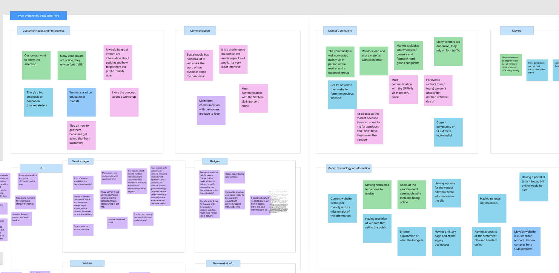
Key Insights From Clients and vendors
Clients:
Clients need reliable info on market hours
Easy way to access vendor info
Thought there was a lack of clarity around membership requirements
Vendors:
20% of vendors filled out the survey
90% gain new clients in person/ word of mouth, limiting growth
Outdated visual and information, confusing UI; navigation, typeface etc.
competitive and comparative analysis

We evaluate how our website, San Francisco Flower Market, compares to key competitors in the Flower market.
Competitor Identification:
Our primary competitors include Columbia Road, The Original LA Flower Market, BloomNation, Farmgirl Flowers, Flower Girl NYC, and California Flower Market, all of which either sell online or have multiple vendors.
Criteria for Evaluation:
We assessed competitors based on features, user interface, vendor details, and navigation.
Refining the project scope
Based on the user interviews and live usability testing with 10 users and 256 responses in the survey, we found the following key issues:
Poor User-friendliness
Users found the website challenging to navigate and lacking intuitive information organization and accessibility.
Limited vendor information
Users were frustrated by the lack of details about vendors, including product offerings, pricing, and contact information. This hindered their ability to make informed decisions and connect with vendors.
outdated content/features
Users encountered confusion with certain terms used on the website, such as "badge," which impacted their understanding of key market aspects.
Difficulty understanding terminology
Participants noticed outdated information, including signing up for membership in person, vendor information, and hours, causing confusion and inconvenience for users seeking current vendor information or planning visits.
Now that we know the challenges, let’s talk about how we can solve them

Here’s the MVP for the website
-
Enhance user experience with a clear and intuitive website structure.
-
Include detailed product offerings, contact information, social media, and online purchasing options for vendors.
-
Implement secure online payment processing for customer purchases.
-
Have options for users to purchase and manage their badge memberships online.
Designing a New Experience
We created wireframes to gather feedback from stakeholders, showcasing a standardized visual hierarchy and layout for the upcoming SFFM website.
Addressing the problem with solution:
Combat overwhelming text by restructuring the content and utilizing multimedia to enhance readability
Vendors will have dedicated pages showcasing their information and services, complete with search and filter option
Streamline the membership application and sign-up process with clear instructions, an online form and easy payment options.
Usability testing and tracking CRO with ongoing iterations will ensure a positive user experience.
Create a navigation menu that aligns with users and the SFFM’s needs. A visually appealing new branding-aligned designs
We began with low-fidelity wireframes in Figma to map out the core structure. This collaborative process allowed us to iterate quickly and align our vision with stakeholder expectations.
Sketching:

Low Fidelity Wireframes:
Home Page
About Page


Visit Us Page
Badge Page


Vendors Page

Individual Vendor Page

Armed with this feedback, we made impactful changes
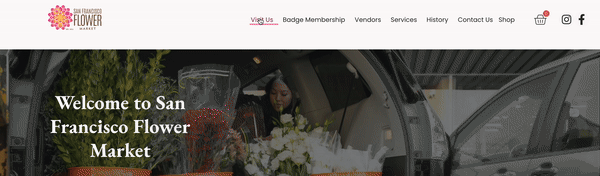
Navigation: Simplified menus to prioritize essential information.
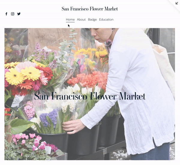
Original Site
Redesigned Site
Membership Clarity: Streamlined and digitized the application process.
Original Site
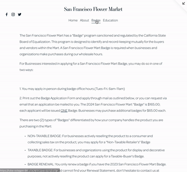
Redesigned Site
Vendor’s information: More information on the vendors was added. Having a page dedicated to each vendor stall. With their socials, contact, hours, etc
Original Site

Redesigned Site
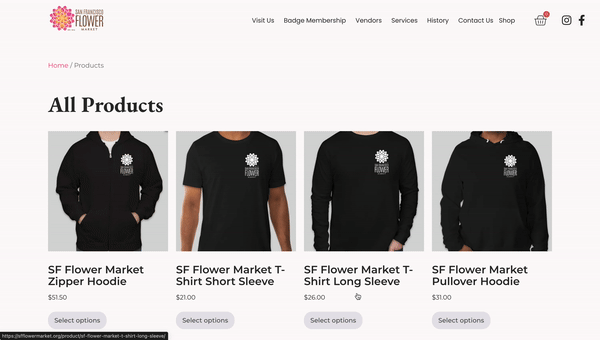
E-Commerce: Introduced an online store for merchandise and vendor products.
Original Site

Redesigned Site
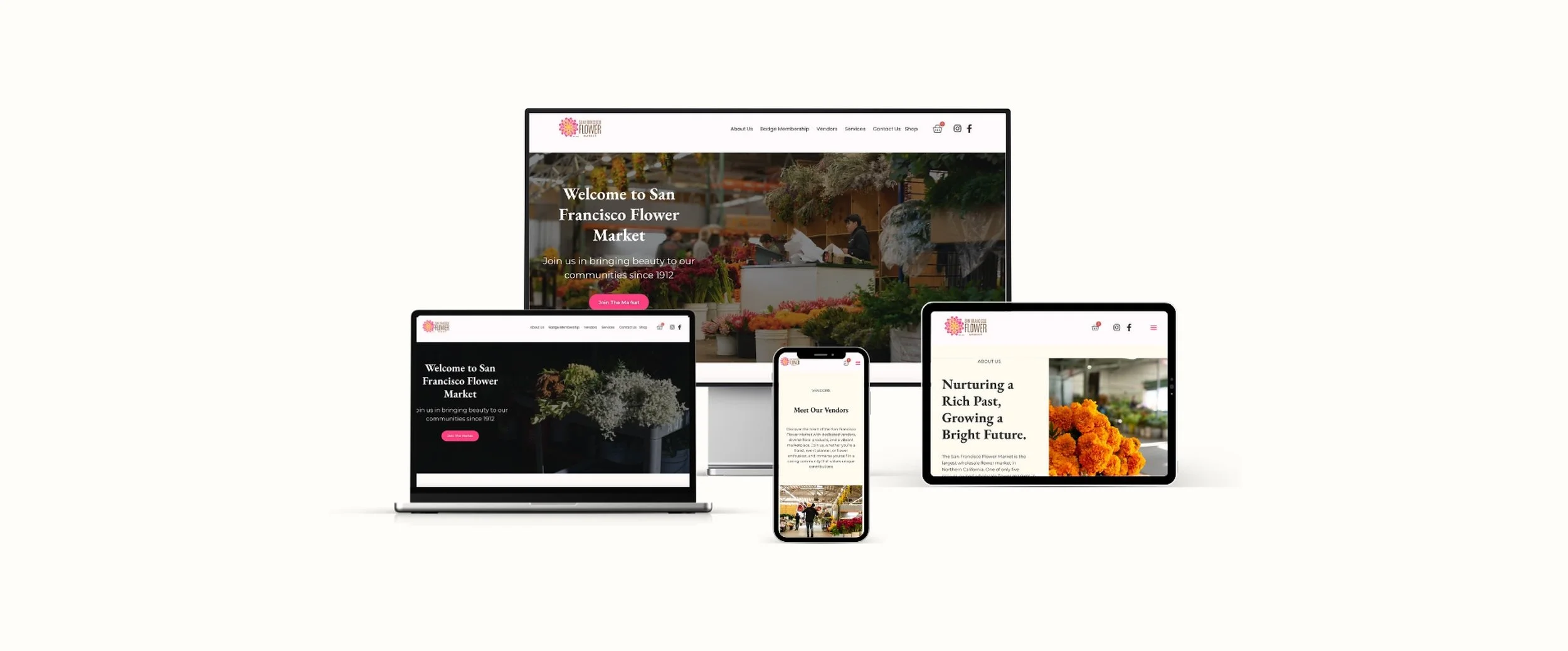
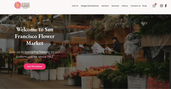
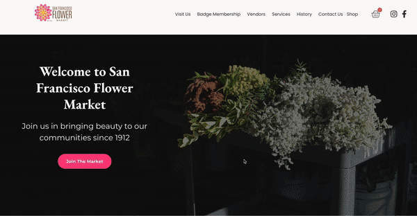
Final Design
Looking Ahead
The redesign is only the beginning. Future opportunities include:
A login system for personalized user experiences.
A reservation system for the market’s loading docks.
Vendor-managed profile pages to keep content fresh and engaging.