Boosting patient engagement and online appointments

Bozan Chiropractic, a trusted clinic with over 20 years of service in New Jersey, sought to transform its digital presence. With COVID-19 reshaping healthcare engagement, their traditional reliance on word-of-mouth referrals was no longer sufficient. They needed a website.
The founder needed a clean, trustworthy website that would attract local clients and convert them into booked appointments. I led the brand strategy, UX design, and no-code development with a focus on conversion, ensuring the site not only reflected the founder’s values but also encouraged bookings and inquiries.
This case study captures the journey of redesigning their website to achieve these goals while balancing user needs and budget constraints.
ROLE: UX Researcher, Visual Design, Digital Marketing, Branding
INDUSTRY: Healthcare
CLIENT: Bozan Chiropractic
The Diagnosis
A combination of user interviews and heuristic evaluation revealed several pain points
-
Content overwhelmed visitors and obscured key information.
-
Users struggled to locate the appointment booking feature, leading to drop-offs.
-
Misinformation about offered services eroded trust.
-
Poor navigation and inconsistent UI disrupted the user journey.
Conversion Goals & Strategy
While designing the site, I focused on building trust, reducing decision fatigue, and streamlining the path to booking. My CRO approach included
The primary goal was to increase client bookings through the new website. The original site had no clear call to action, and users had to scroll or click through multiple pages to find how to book an appointment.
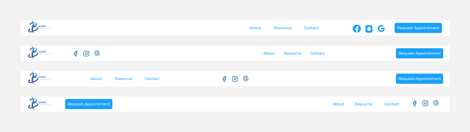
Sticky CTA for Easy Booking
A persistent “Book Now” button in the top nav for easy access at all times
Simplified Service Summaries
Clear, scannable service descriptions to reduce overwhelm
Trust-Building Testimonials
Client testimonials to build credibility and increase trust
Skimmable, Visual Content
Replacing long text blocks with visually digestible sections
Mobile-Frist Approach
A mobile-first layout optimized for local users on the go
User-Centered Design Solutions


Building with Budget Constraints
Given the limited budget, we opted for Squarespace, an affordable and user-friendly website builder. This allowed for rapid prototyping and iterative design updates without incurring high development costs.
Low Fidelity Wireframes
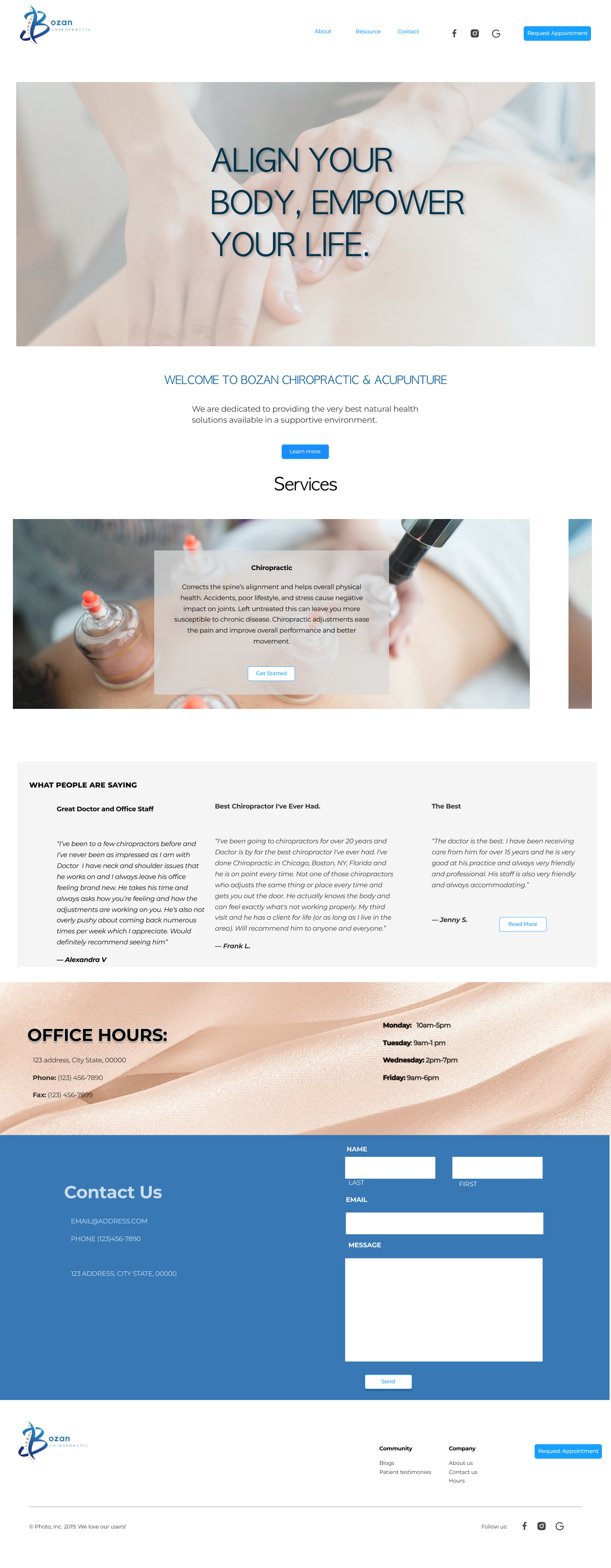
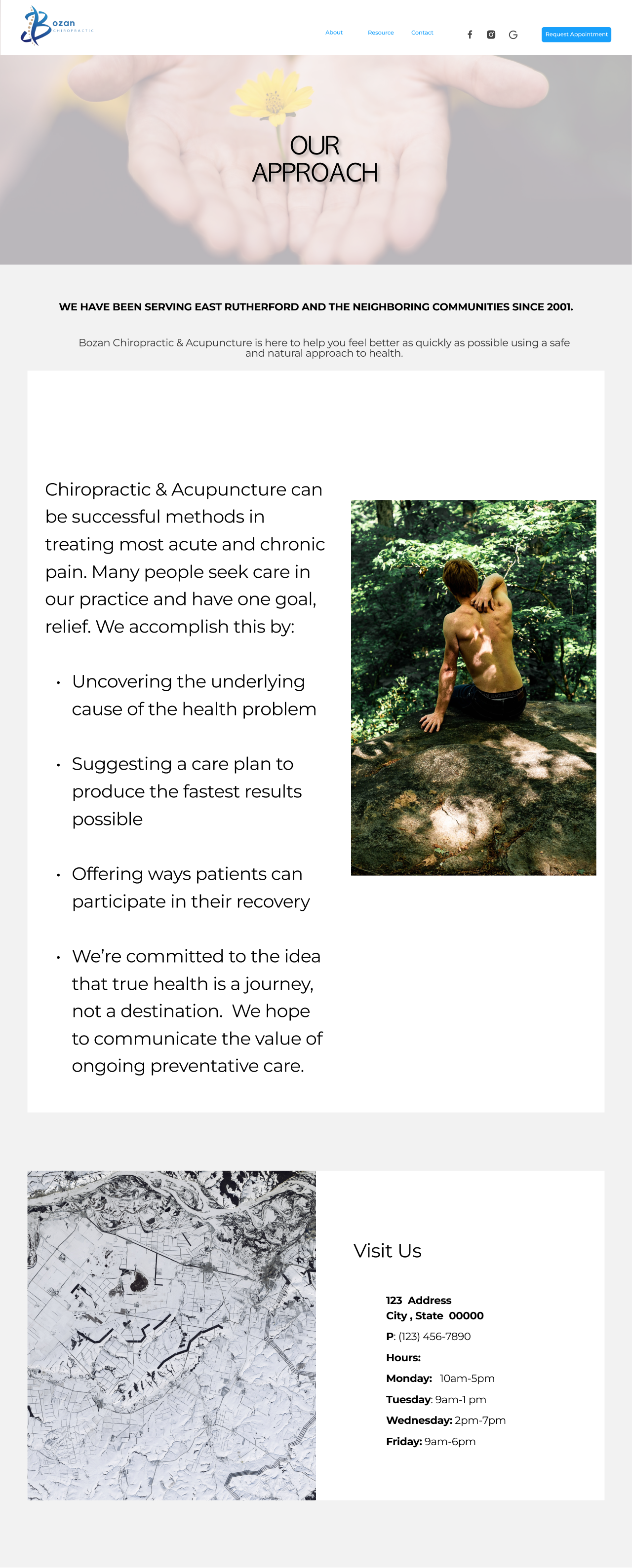
Home Page

Meet the Doctor Page

Scheduling Page

About Page

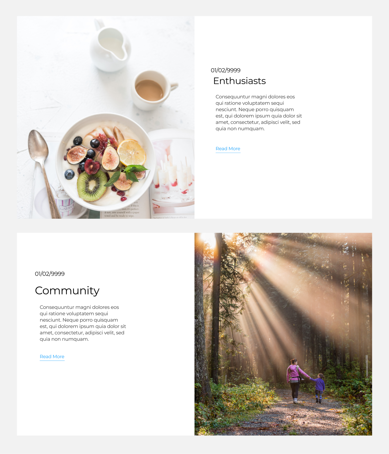
Blog Page
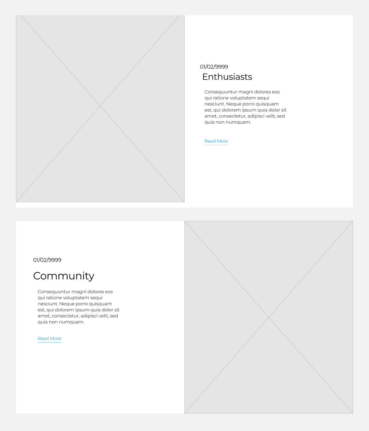
Services Page
Iterative Testing & Refinement
To ensure the website catered to user needs, I conducted multiple rounds of usability testing with a small group of target patients. Each round focused on specific aspects of the website, allowing for iterative refinement based on their feedback.
Live Testing with Target Users
Live user testing with 4 patients (3 rounds focusing on navigation, IA, usability, booking flow, and visual design) revealed the need for a website overhaul. We identified issues with structure, booking, and visuals. User feedback guided iterative refinements, resulting in a significantly more user-friendly experience.Round 1
Navigation & Information Architecture
Task
Users were given specific tasks to complete, such as finding information about a particular service or locating clinic contact details.
finding
Users struggled with the menu structure and locating key pages
changes made
Restructured the navigation menu for better clarity and implemented a more logical information hierarchy, making it easier for users to locate desired content.
A/B Testing
To measure the impact of these changes, I ran A/B tests on the homepage layout and call-to-action placement over two weeks. The variation with the sticky navigation bar and a simplified hero section outperformed the original by 32% in click-throughs to the booking page.
This data helped validate the conversion-focused decisions and ensured the final design was not only visually clean but also strategically effective.
Round 2
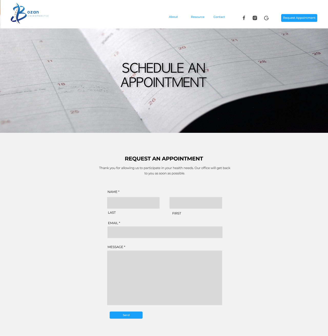
Appointment Booking Flow
Task
Users were asked to walk through the appointment booking process, simulating scheduling an appointment.
finding
Confusing forms and unclear instructions frustrated users.
changes made
Simplified the booking process by removing unnecessary fields and adding step-by-step instructions.
Round 3
Visual Design & Readability
Task
Users were presented with the website prototype and asked to evaluate its visual design and information clarity.
finding
Low contrast and small font sizes hindered readability; the design lacked engaging visuals.
changes made
Increased font size and contrast, added high-quality images, and updated the color scheme for a modern, professional look.

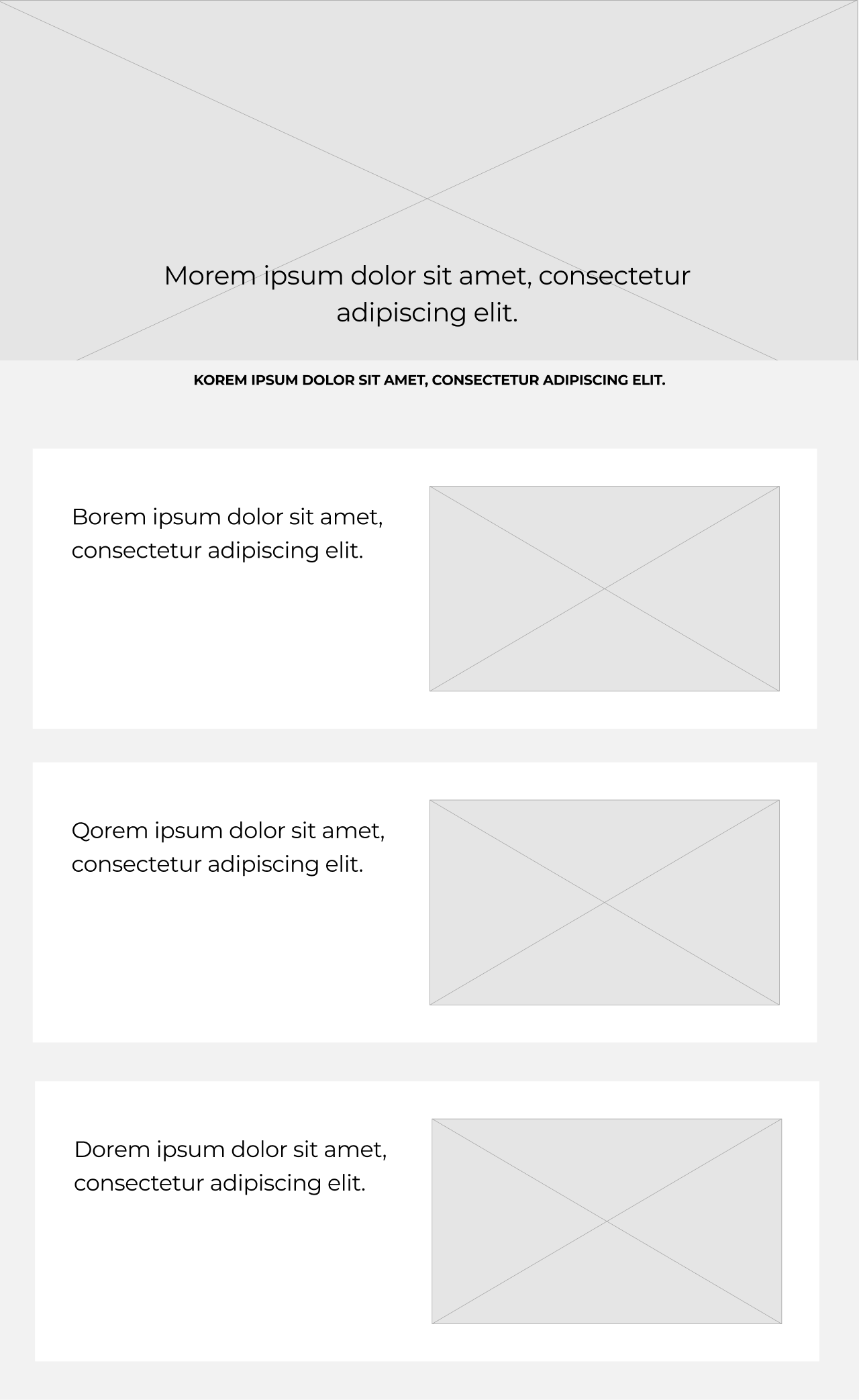
High Fidelity Wireframes
Home Page
Scheduling Page

Meet the Doctor Page

About Page
Blog Page
Services Page

The Impact

The redesigned website delivered measurable improvements
After launch, the founder reported that new clients were finding the site easier to navigate and were booking directly through the site rather than calling with questions. The streamlined layout and improved clarity reduced her time spent managing inquiries.
40% Increase in online appointment bookings within the first month of launching the site .
Significant Reduction in user drop-off rates during the booking process.
Higher user retention and positive feedback on the new design.
FUTURE ROADMAP
-
USER CONVENIENCE
Calendar-based appointment scheduling.
Automated reminders to reduce no-shows.
-
Empowering Patients
Settings page for managing preferences.
A long-term goal to build a secure patient portal.
-
Content Strategy
Regular updates to keep the site fresh and relevant.